Monday, December 1, 2014

Post #11

Who is Andy Warhol?
Andy Warhol is an American artist who was a leading figure in the visual art movement known as pop art. 

Within what art genre did Warhol work?
He worked within the pop art genre. 


Define the genre?
Pop art is painting that focused on mass produced commercial goods.  


During what years was he alive?
He was alive between 1928 until 1987. 


Post 2 samples of his art. Answer the following questions for each piece.Title of the piece? Describe the color that he utilizes.  Does he use any particular color scheme?
What do you notice about the artwork itself?

Campbell's Soup Cans


The colors he uses are red and gold and black and white, these are the similar colors used on the actual can. The artwork is really unique and interesting. He was able to make an ordinary can of soup become an interesting pop art painting and design. The artwork is simple yet interesting and only difference is the names of the different soups.


Moonwalk

Moonwalk, 1987
The colors he uses are bring neon colors that are contrasting. There is bright pink and gold with the colors of the american flag and the dark blue color of the moon. There is not really any particular color scheme. The artwork is interesting because it takes an ordinary picture into a new design of cool artwork. 

Monday, November 24, 2014

Post #10

Compare and contrast vector graphics and pixel images. 

Vector graphics is using shapes or geometric objects such as lines, points and curves to create a design or image. Pixel images use dots such as red, blue or green to create images.

What resolution is necessary to print raster images?

The resolution of 300 pixels is necessary to print raster images.


What resolution is necessary to display raster images on the internet?

The resolution of 72 pixels or more is needed to display raster images on the internet.

Post #9

Who is Steve Jobs?
Steve Jobs was an American entrepeuner, marketer and inventor. 

What company was he CEO for many years?
The company he was CEO for many years was his own company Apple Inc. 

What did he do for the computer industry?
He made magnificent changes to the computer industry because he invented things using simple things to make amazing things that worked and innovations that helped improve the use of computers. He made new technologies such as the mouse and computers.

How did this man impact the graphic design industry?
He impacted the graphic design industry because he worked with the great company Pixar. By working with them, the animation company was able to work with new designs and take a small animation company to make great changes and designs and animation. 

Post #8

Why must designers pay close attention to how color is utilized within a composition?

Designers must pay close attention to how color is utilized within a composition because it can draw attention to viewers. It can also make their designs more attractive or not. By paying close attention how the color is utilized they can make their design colors more vibrant and drawing more attention to the audience viewing it.

Why is the color wheel an important tool for graphic designers?

The color wheel is an important tool for graphic designers because it can help them utilize colors into their design. They are able to put different shades of colors into their design to help make them stand out more. The color wheel provides the different colors the graphic designers need to make their design better and colorful.

Find an example of neutral colors utilized within a design (hint: google poster design). Near the sample, discuss why you feel the designer included neutral colors within the composition.

The designer included neutral colors because it can add contrast to the main image in it. It did not distract the viewers from the image of the horse by using the neutral colors in the background.

preframed

Briefly describe how we "see" the color of an object?

We can see the color of an object with the cones in our eyes and because of white light reflection. 

Sunday, November 23, 2014

Post #7

Video #2 Color Theory

Describe white light? 
White light from the sun is made of all colors. 

How do we see color if objects "have no color of their own"? 

The color is in the  white light from the electromagnetic spectrum.

What seven colors result when white light is refracted through a prism? 
The seven colors refracted through a prism is red, orange, yellow, green, blue, indigo and violet. 

Describe hue? 
It is the pure color


What happens with white? 
It is created with all the colors of the spectrum. 


What happens with black?
It is the absence of light.


How color is perceived depends on what?
It depends on the light wavelengths. 


What is a color wheel? 
A color wheel is a wheel that organizes all the colors in a spectrum. 


What are primary colors? Name them? 
Primary colors are colors that cannot be made by combining. They are red, blue and yellow. 

What are secondary colors? Name them? 
Secondary colors are colors that are made by 
mixing two primary colors. they are orange, green, and purple. 

What are tertiary colors? Name them? 
Tertiary colors are colors made by mixing a primary color with a secondary color, they make yellow orange, red orange, red purple, blue purple, blue green, yellow green.


What are neutral colors? How can they be created? 
Neutral colors are earth tones that are not normally on the color wheel. They can be created by mixing complementary colors together. 


How can a neutral color help a design?
A neutral color can help a design by using it as a "rest" for the viewer's eyes or as place to draw from attention. 

What are complementary colors? Name them? 
They are the colors opposite of each other on the color wheel. They are yellow and purple, blue and orange, and red and blue. 

What is color value? 
A color value is the brightness of the color.


What is a shade? 
A shade is the darker hue of a color made by adding black.

What is a tint?
A tint is a lighter hue of color made by adding white light.

What is saturation/intensity?
Saturation and intensity is how pale or strong the colors are.

What happens when you mix complementary colors together? 

When you mix them together you get a neutral color.

What is a color scheme? 
A color scheme is the arrangement or choices of color in a design.

Describe a monochromatic color scheme? 
A monochromatic color scheme is one with only one color. 

Describe an analogous color scheme? 
An analogous color scheme is one with color right next to each other on the color wheel.

Describe a complementary color scheme?
A complementary color scheme is one with opposite of each other on the color wheel. 

Describe a split-complementary color scheme? 
A split-complementary color scheme is when one of the two colors are omitted and a color on each side of it is used instead of the other.

Describe a triadic color scheme? 
A triadic color scheme is colors on the color wheel that create together a triangle.

What colors are considered to be warm colors? 
Red, orange, and yellow are considered to be warm colors.

Describe the psychology of a warm color scheme?
The psychology of a warm color scheme can make the audience or viewer feel comfortable and gives off energy or excitement.

What colors are considered to be cool colors? 
Green, blue and purple are considered to be cool colors. 


Describe the psychology of a cool color scheme?
The psychology of a cool color scheme is to make the audience or viewer feel calm.

Why is important to consider which colors are being used within a design?
It is important to consider which colors are being used within a design because it can make a design more appealing or attractive to the audience and it can draw attention to different groups creating different moods. 


Thursday, October 9, 2014

Post #6

What is the pen tool used for?
The Pen tool is used to connect lines and creates paths to form a picture. It is used to create the anchor points that form the basis of the design, and to connect those lines to those points to make the curves and shapes on illustrator. 

How can you manipulate a path/line in Illustrator? 
You can manipulate a path or line in Illustrator by using the pen tool, and click on the anchor points to either curve the shape or move it. By using the selected anchor points to curve, the lines will move with it and the paths will create a new shape.

Discuss the use of the white arrow tool. Pen+, pen-,and convert tool.
The white arrow tool is the Direct Selection tool. It is used to select certain points or path segments within objects. The pen + tool is used to add an anchor point, while the pen - tool is used to delete an anchor point. The convert tool is used to convert a smooth point to either a corner and a corner point  to a smooth point. 


How can you utilize the layers palette in Illustrator?
You can utilize the layers palette by first going to Windows then click layers to organize or edit the objects in the design document. By using the layers palette, different layers to the design or object can be changed, whether it is color or the overall shape. The layers can also help create different designs while layering onto the original design. 


How do you create a clipping mask in Adobe Illustrator?
A clipping mask is an object where it covers other artwork so that only areas that lie within the shape are visible, so that it is only the shape visible. To create this, you must first create the object wanted as the mask. Then move the clipping path and the objected wanted to be masked onto a new layer. Making sure that the masking object is on the top and the rest on the bottom in the layers palette. 

Post #5

For each of the 5 elements of design (shape, line, texture, space, value), find an example that utilizes each element within the design (Google search for poster design, advertisement, etc.). You should have 5 DIFFERENT sample designs.  For each, evaluate the design in 4 to 5 sentences.  Label each with the appropriate element.  Then, discuss how that particular element is used and how it enhances the 
design.


Apple Announces Two New iPhones: iPhone 6 And iPhone 6 Plus 
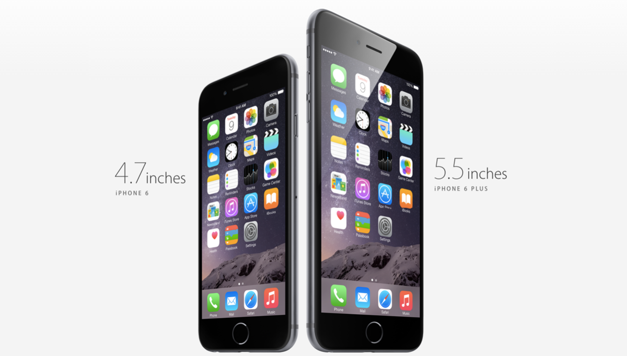
The element of design utilized in this Apple iPhone ad is shape. It includes the square shape of its icons in the phone, as well as the iPhone shape itself, a rectangle. This is used to enhance the design because it is easy handle and a simple looking design for a phone ad.


The element of design utilized in the book cover of "Eclipse" is space. The space makes the ribbon on the book cover stand out, enhances the importance of the ribbon symbol. The space makes the ribbon more important and shows the importance of it in the book. The space makes the cover seem more interesting and attracts readers to the books because of its simple design.


The element of design utilized in this book cover is value. Value refers to dark and light and this book cover shows it well. The value contrasts helps us to see the artwork better. It is relative to the background of the other words and items on the page.The black and white value contrast leads the eye to the picture and the words of on the cover.


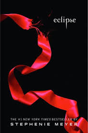
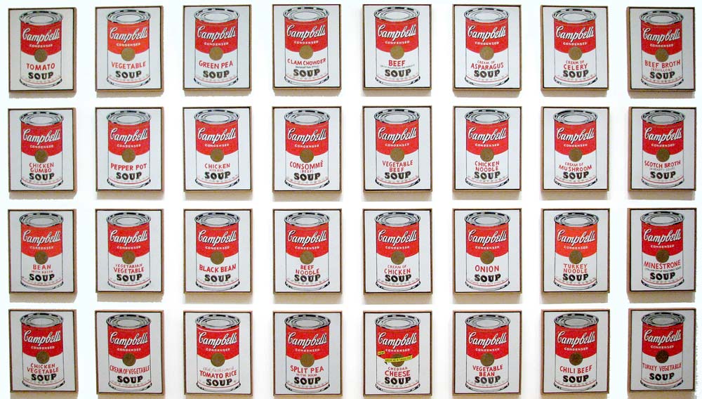
The element of design utilized in this movie poster is Lines. They are used in the poster to divide the space, and placed as a grid. It separates the different pictures, and the overall summary of pictures on the poster. The lines directs the flow of the pictures on the poster. The lines on the poster also direct the audiences eyes to each picture, which makes up the storyline of the poster.


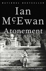
    The element of design utilized in this movie poster is texture. Although the audience member is not able to touch the water used in this movie poster, it shows the audience the background is water. The way the design in the background and the dolphins in the picture, makes the texture of water on the movie poster more believable. The texture of the design, which is water enhances the realistic parts of the poster. It makes the audience want to look at it longer, because it looks so real. 

Saturday, October 4, 2014

Post #4

Why/how can icons be used to communicate?
Icons can be used to communicate because it helps a person identify certain pictures or messages behind each icon. It helps a person understand an image even if they do not know the language. 

Via the internet, find 2 examples of common icons that clearly communicate their message. Post both in this entry and explain your choice.


I choses these two common icons that are clear to understand. I chose the bus icon because it is easy for a person to understand and find if they get lost or do not understand the language. It is easy to understand what this looks like and can quickly identify what it is. Another icon I chose it the restroom icon. It clearly communicates its message, and in most parts of the world, it means that it is either a restroom or area for sanitation.

What is the difference between copyright and public domain?
Copyright is the protection to a person's original work. It is the legal right for the owner to do anything to their work, as well as authorize others. Whereas public domain, it can be used by anyone freely. In public domain, no one owns a work, and there is no ownership. 


How can you avoid plagiarism in this class?  In other classes?
Plagiarism can be avoided in this class by not using or copying another person's work exactly. A person has to be original and produce their own ideas and works. In other classes, they cannot have exact copies or have the same answers. It can also be avoided by providing a source if a person is copying.

Sunday, September 14, 2014

Post #3

What is OSHA? What do the letters stand for?

OSHA is an agency of the United States. It is for safety, and all companies follow these to protect employees. OSHA stands for occupational safety and health administration. 

How can graphic designers effectively communicate? In your own words, explain the communication process.
Graphic designers can communicate effectively by talking to the customer about what they want and also the way the present their designs. Also, the communication process is through the color or their designs.

Understanding the history, culture and movements of fine and graphic arts will make you a better producer of visual messages. Why?
Understanding the history, culture and movements of fine and graphic arts will make you a better producer of visual messages because it gives the more diversity and different perspective. This would help with the visual messages with feelings and the words given off to the design. 

Thursday, September 4, 2014

Post #2


What does it take to create good graphic design? It requires an understanding of the elements and principles of graphic design. 

What is the difference between elements and principles? Elements are the components of parts which isolated in any visual design or work of art. They are the actual things we add to the design. While principles tell us how we should organize those elements on a page or a screen.  

Name the six (6) elements of design. The six elements of design are line, shape or form, texture, value and color. 

What can lines aid in, when alone or combined with other lines or shapes? Lines form the shape of an image, they can be used to denote a specific meaning, from free spirit to discipline. When combined, they can aid in readability, appearance and message of a design. 

Which lines suggest a feeling of rest? Why do you think? Horizontal lines suggest a feeling of rest, because they are in relation to gravity and are laying down. 

Vertical lines communicate a feeling of what? Why do you think? Vertical lines communicate a feeling of loftiness. I think this is so because it is straight and not lying down. 

What lines suggest a feeling of movement? Why do you think? Diagonal lines suggest a feeling of movement because it is facing a certain direction and show a way of path.  

Soft, shallow curved lines suggest what? Why do you think? Soft, shallow curved lines suggest comfort, safety relaxation. I think this is so, because it is in relation to not being structured like straight, hard lines. 

These lines suggest confusion and turbulence? Why do you think? Curved lines suggest confusion and turbulence. This is because it depicts violence of waves or storms. 

What element defines a specific area of space? What is the difference between two dimensional shapes 
and three dimensional shapes? Shapes is the element that defines a specific are of space. Two dimensional shapes has width and height. Three dimensional shape has depth as well as width and height.

Describe the difference between geometric shapes and organic shapes? Geometric shapes are a structured, often symmetrical shapes. These might include squares, circles, and triangles, as well as octagons, hexagons and cones. Natural or organic shapes are found in nature or they or can be man made shapes. They are often irregular or fluid, an example such as leaves. 

What are abstract shapes? Abstract shapes are stylized or oversimplified version of natural shapes. Symbols found on signs such as the wheelchair shape for handicapped access is an example.  
 
Which basic shape projects an attitude of honesty or equality? The basic shape, square, projects an attitude of honesty or equality. 

What do triangles suggest? The triangle suggests action. It can also suggest stability if it is a pyramid shaped. 

Circles convey feelings of what? Circles convey feelings of protection or infinity.

Describe positive space and negative space? What is texture? Incorporating texture into a design can 
help do what? What is value?  Positive space refers to the objects and elements used in a design. Positive space is the area which contains all of the elements you have added to your design, which may include text, graphics, photos, lines, or shapes. While negative space refers to shape around and between those objects and elements. Negative space or white space, gives a place for the eye to rest. Which is needed for the message you are trying to communicate to be absorbed. Texture can refer to the actual surface of a design, with the reader actually being able to feel the texture of the paper and materials in the printed design. Incorporating texture into design can help create a feeling of richness and depth. Value is the degree of light and dark in a design, and it is a contrast of black and white and all the tones in between. It can be used in color as well as black and white. It gives objects depth and perception, creating spacial illusions.  


What is another name for value? What can the element of color do when incorporated into a design? Value is also referred as tone. The element of color can convey moods, create images, attract attention, and identify objects when incorporated into a design. 

Friday, August 29, 2014

Post #1

I took this class because I wanted to learn more about creating designs online.
The goal I have for the class is to be able to create designs, and learn more about creating visual messages.