For each of the 5 elements of design (shape, line, texture, space, value), find an example that utilizes each element within the design (Google search for poster design, advertisement, etc.). You should have 5 DIFFERENT sample designs. For each, evaluate the design in 4 to 5 sentences. Label each with the appropriate element. Then, discuss how that particular element is used and how it enhances the
design.
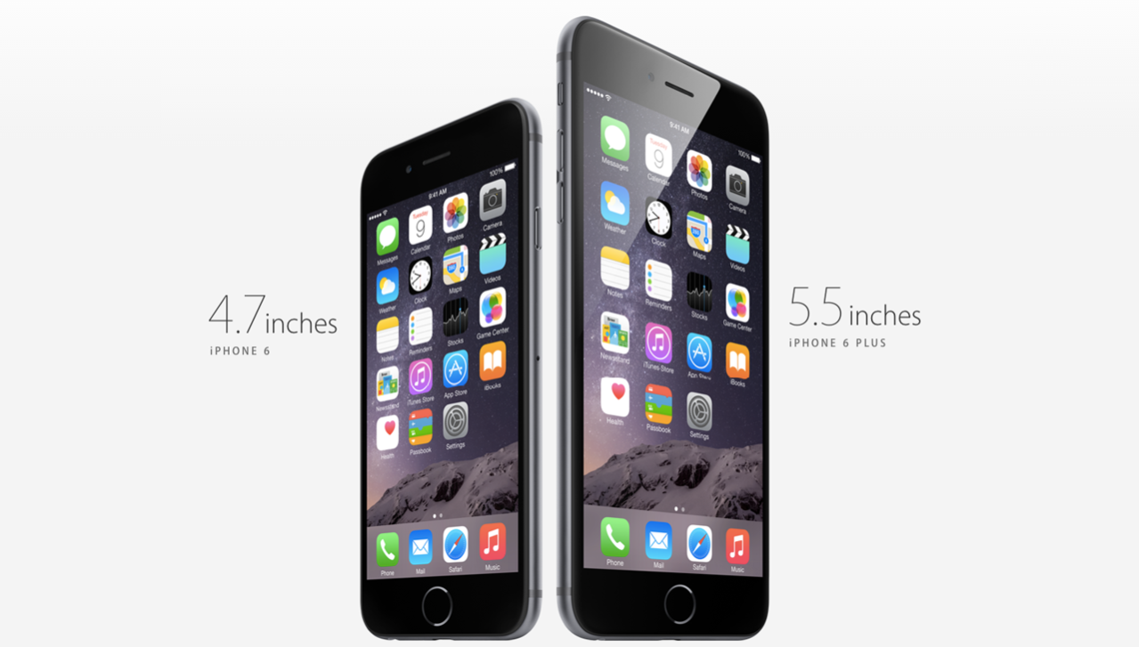 The element of design utilized in this Apple iPhone ad is shape. It includes the square shape of its icons in the phone, as well as the iPhone shape itself, a rectangle. This is used to enhance the design because it is easy handle and a simple looking design for a phone ad.
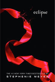
 The element of design utilized in the book cover of "Eclipse" is space. The space makes the ribbon on the book cover stand out, enhances the importance of the ribbon symbol. The space makes the ribbon more important and shows the importance of it in the book. The space makes the cover seem more interesting and attracts readers to the books because of its simple design.
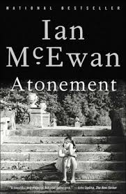
The element of design utilized in this book cover is value. Value refers to dark and light and this book cover shows it well. The value contrasts helps us to see the artwork better. It is relative to the background of the other words and items on the page.The black and white value contrast leads the eye to the picture and the words of on the cover.
 The element of design utilized in this movie poster is Lines. They are used in the poster to divide the space, and placed as a grid. It separates the different pictures, and the overall summary of pictures on the poster. The lines directs the flow of the pictures on the poster. The lines on the poster also direct the audiences eyes to each picture, which makes up the storyline of the poster.
 The element of design utilized in this movie poster is texture. Although the audience member is not able to touch the water used in this movie poster, it shows the audience the background is water. The way the design in the background and the dolphins in the picture, makes the texture of water on the movie poster more believable. The texture of the design, which is water enhances the realistic parts of the poster. It makes the audience want to look at it longer, because it looks so real.
design.
The element of design utilized in this Apple iPhone ad is shape. It includes the square shape of its icons in the phone, as well as the iPhone shape itself, a rectangle. This is used to enhance the design because it is easy handle and a simple looking design for a phone ad.The element of design utilized in the book cover of "Eclipse" is space. The space makes the ribbon on the book cover stand out, enhances the importance of the ribbon symbol. The space makes the ribbon more important and shows the importance of it in the book. The space makes the cover seem more interesting and attracts readers to the books because of its simple design.The element of design utilized in this book cover is value. Value refers to dark and light and this book cover shows it well. The value contrasts helps us to see the artwork better. It is relative to the background of the other words and items on the page.The black and white value contrast leads the eye to the picture and the words of on the cover.
The element of design utilized in this movie poster is Lines. They are used in the poster to divide the space, and placed as a grid. It separates the different pictures, and the overall summary of pictures on the poster. The lines directs the flow of the pictures on the poster. The lines on the poster also direct the audiences eyes to each picture, which makes up the storyline of the poster. The element of design utilized in this movie poster is texture. Although the audience member is not able to touch the water used in this movie poster, it shows the audience the background is water. The way the design in the background and the dolphins in the picture, makes the texture of water on the movie poster more believable. The texture of the design, which is water enhances the realistic parts of the poster. It makes the audience want to look at it longer, because it looks so real.
No comments:
Post a Comment