What is the pen tool used for?
The Pen tool is used to connect lines and creates paths to form a picture. It is used to create the anchor points that form the basis of the design, and to connect those lines to those points to make the curves and shapes on illustrator.
You can manipulate a path or line in Illustrator by using the pen tool, and click on the anchor points to either curve the shape or move it. By using the selected anchor points to curve, the lines will move with it and the paths will create a new shape.
Discuss the use of the white arrow tool. Pen+, pen-,and convert tool.
The white arrow tool is the Direct Selection tool. It is used to select certain points or path segments within objects. The pen + tool is used to add an anchor point, while the pen - tool is used to delete an anchor point. The convert tool is used to convert a smooth point to either a corner and a corner point to a smooth point.
How can you utilize the layers palette in Illustrator?
You can utilize the layers palette by first going to Windows then click layers to organize or edit the objects in the design document. By using the layers palette, different layers to the design or object can be changed, whether it is color or the overall shape. The layers can also help create different designs while layering onto the original design.
How do you create a clipping mask in Adobe Illustrator?
A clipping mask is an object where it covers other artwork so that only areas that lie within the shape are visible, so that it is only the shape visible. To create this, you must first create the object wanted as the mask. Then move the clipping path and the objected wanted to be masked onto a new layer. Making sure that the masking object is on the top and the rest on the bottom in the layers palette.
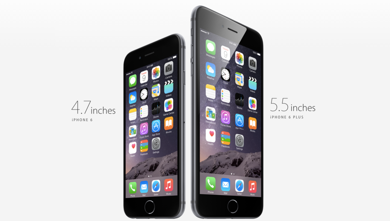 The element of design utilized in this Apple iPhone ad is shape. It includes the square shape of its icons in the phone, as well as the iPhone shape itself, a rectangle. This is used to enhance the design because it is easy handle and a simple looking design for a phone ad.
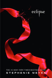
 The element of design utilized in this movie poster is Lines. They are used in the poster to divide the space, and placed as a grid. It separates the different pictures, and the overall summary of pictures on the poster. The lines directs the flow of the pictures on the poster. The lines on the poster also direct the audiences eyes to each picture, which makes up the storyline of the poster.
 The element of design utilized in this movie poster is texture. Although the audience member is not able to touch the water used in this movie poster, it shows the audience the background is water. The way the design in the background and the dolphins in the picture, makes the texture of water on the movie poster more believable. The texture of the design, which is water enhances the realistic parts of the poster. It makes the audience want to look at it longer, because it looks so real.